
“Are you feeling okay? You look a bit tired today.”
I felt perfectly fine. I’d actually had a great night’s sleep. But later, when I caught my reflection, I could see what they meant. The top I’d loved on the hanger made the shadows under my eyes stand out. I tried on another top and suddenly looked a little more awake. Same face, same lighting. All I’d changed was the colour of my shirt.
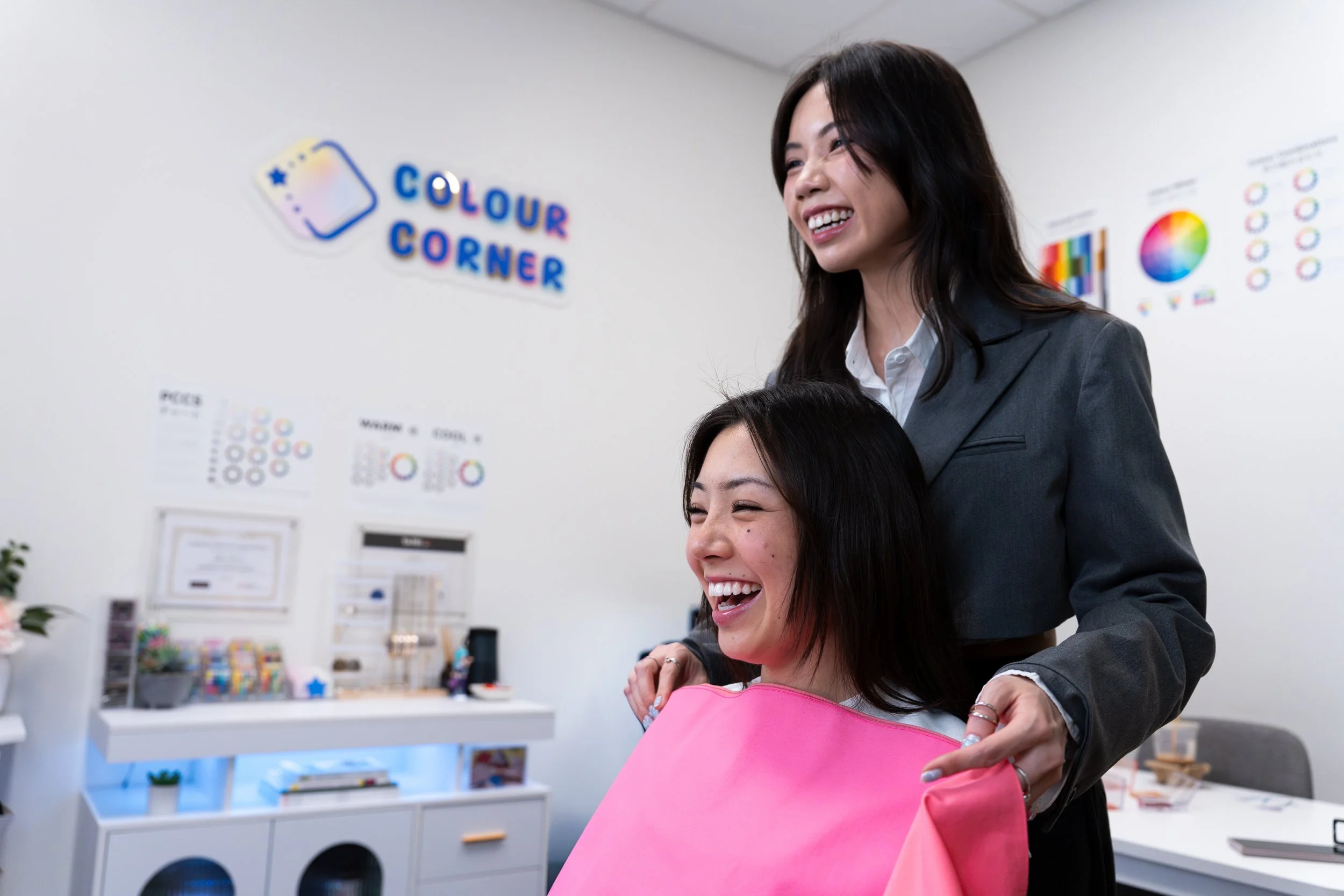
That’s what personal colour analysis is all about. Personal Colour Analysis (PCA) is the process of comparing colours near your face to see how they interact with your natural colouring. In a session, we use fabric drapes to compare how different shades sit alongside your skin, eyes and hair. We look for patterns in what works together, then turn those observations into a palette you can use for clothes, makeup, hair colour and accessories.
Where did Personal Colour Analysis come from?
Personal Colour Analysis draws on early twentieth-century colour theory. At the Bauhaus, Swiss artist and educator Johannes Itten explored colour harmony, using the four seasons to illustrate how colours relate to one another. His work provided a conceptual foundation for later seasonal approaches.
Carole Jackson popularised the four-season model with her 1980 book Color Me Beautiful. The model considered the relationship between a person’s skin, hair and eye colours to recommend one of four palettes associated with Spring, Summer, Autumn or Winter.
As personal colour analysis spread internationally, practitioners developed more detailed approaches. Colour Corner uses a Japanese 12-type system that divides each season into three palettes. During an analysis, the analyst compares how colours of different temperatures, depths and intensities affect the appearance of each client’s features. No matter your gender, age, skin tone or background, anyone can use colour analysis to discover colours they’ll enjoy wearing.
Why colour looks different depending on what’s next to it
Two identical grey squares. Put one against black and the other against light grey. The first can look lighter, while the second looks darker. The grey stays the same. Your perception of it changes because of what’s around it. This is an example of simultaneous contrast.
You can see the same principle at work in a painting, a website or your wardrobe. An illustrator can make a blue feel more vivid by changing the colours around it. A designer can make a headline easier to spot by increasing its contrast with the background. And when you swap a cream top for a crisp white one, different details in your face may catch your attention.
During a colour analysis, we change the drape under consistent lighting so you can see those shifts side by side. You might notice the colour of your eyes more clearly in one drape or find your attention goes straight to the fabric in another. Those are the kinds of observations we talk through together.
What are we looking for at during a colour analysis?
Think about the last time you went looking for a pink top. Did you reach for a peachy pink, a pale blush or a bright fuchsia? They’re all pink, but each has a different mix of qualities. During draping, we compare those qualities side by side to see how they interact with your natural features.
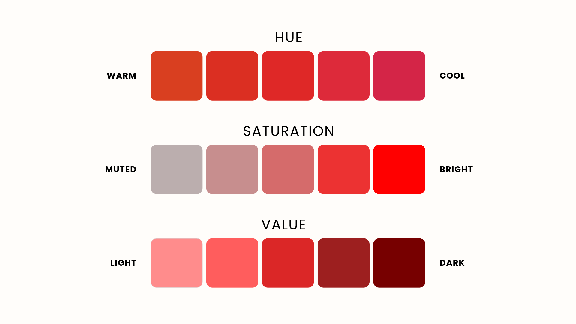
Hue (warm or cool): Hue is the colour family, like red, blue or green. In personal colour analysis, we also look at which way a shade leans in terms of temperature. A tomato red leans orange and feels warmer, while a blue-based cherry red feels cooler.
Saturation (bright or muted): Often called chroma in personal colour analysis, this is how vivid or muted a colour appears. Think bright fuchsia and dusty rose. One pops, while the other has a softer, more greyed quality.
Value (light or dark): Value is how light or dark a colour is. Think powder blue and navy. Both are blue, but powder blue is much lighter.
As we work through the drapes, a pattern starts to emerge. You might find that cool pinks bring out your features, and that the lighter, softer ones feel especially harmonious. That combination tells us more than temperature alone.
At Colour Corner, we use a Japanese 12-type approach to describe these patterns. It builds on the four seasons of Spring, Summer, Autumn and Winter, with three variations within each season. The swatches below show how those qualities come together across a whole palette.
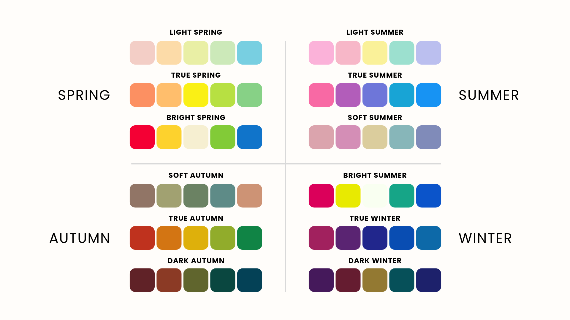
The season name is a shorthand for the pattern. If you learn that lighter, softer shades tend to work well for you, you can use that observation in a shop even when there’s no swatch card handy. Suddenly, “Which pink?” becomes a much easier question.
Where psychology and personal style come in
Two people can share a palette and have completely different reactions to the same shade. One person’s cheerful yellow is another person’s primary school uniform. Research in colour psychology (Meier et al., 2012) points to the importance of context when interpreting how people respond to colour. The occasion, the associations you’ve picked up over time and the way a colour is used can all shape how it feels to you.
That’s part of the conversation at Colour Corner. Maybe your palette includes a beautiful teal, but the thought of wearing a teal blazer makes you feel like you’re dressed as someone else. You could try a small detail, like an earring or a print, or spend more time with the colours you already love. If your favourite colour sits outside your palette, you can also play with where you wear it and what you pair it with.
Try it with clothes you already own
Pick two tops from the same colour family, like a dusty rose and a bright pink. Hold each one under your chin in front of a mirror, keeping the lighting and your position the same. Look at your face first. Where does your eye go? Does anything about your eyes, lips or the shadows around your face appear different?
Then ask yourself which one you’d actually reach for and why. Maybe you love the way one works with your features but you wear the other more because it goes with your favourite trousers. Both observations tell you something about how colour works in your real wardrobe.
A palette can make shopping more intentional but one of the nicest discoveries is finding a fresh way to wear something that’s already hanging in your wardrobe.
Short on colours to compare or can’t quite see the difference in the mirror? We’ll guide you through the drapes and help you spot how different shades bring out your natural features.
Sources & Further Reading
Meier, B. P., D’Agostino, P. R., Elliot, A. J., Maier, M. A., & Wilkowski, B. M. (2012). Color in context: Psychological context moderates the influence of red on approach- and avoidance-motivated behavior. PLOS ONE, 7(7), e40333. https://doi.org/10.1371/journal.pone.0040333
